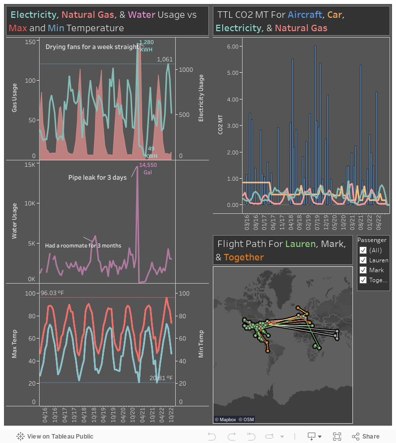
Going Carbon Neutral
Over the years I have become more and more conscientious of my surroundings, the environment, and climate change. I began to think on how we could do better, be better. So, I began accumulating my energy usage and calculating the amount of CO2 metric tonnes that I produce. From there I bought into carbon offsets from CoolEffect. The best option is to reduce your usage, that way the CO2 is never produced in the first place. And then from there, we can offset our carbon output by investing in projects that help reduce and offset carbon output.
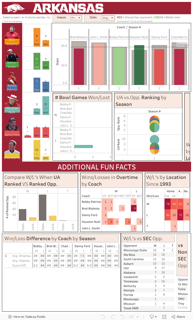
Who is the Best Football Coach Since Arkansas Joined the SEC?
This project was a lot of fun to put together. Most of the data is available on the Arkansas Football program website. However the first couple of years after we had joined the SEC were not available there, so I had to track the data from the opponent's or the NCAA's website. I built this dashboard during the 2017 college football season. There was a lot of talk about Bret Bielema getting the ax after the season if his team did not perform well. The reason I built this dashboard was because I wanted to see how good or bad Bret compared to the rest of the Arkansas coaches since we joined the SEC. Whether you were pro Bret or against him, this dashboard was an unbiased tool to see whether or not his teams were better or worse than any of his predecessor's. After doing the initial collection of the data, it is fairly easy to continue appending the latest data, so for the foreseeable future, we'll get to see how Chad Morris compares to his predecessors.
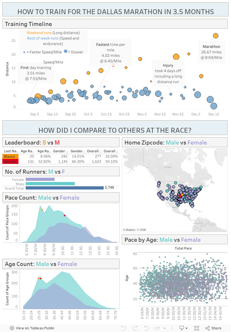
Training for a Marathon in 3.5 Months
I came across the idea to do the following dashboard from a Viz of the Day on Tableau Public. Back in 2015 I trained for and ran in the Dallas Marathon. I had recently gotten a smart watch and so I was able to track all of my runs. The first visualization shows the pace and distance of all my runs as from first day of training until the day of the marathon. The following visualizations highlight the rest of the competition, where they came from, how fast they ran, etc. I highlighted myself and my good friend, who also ran the same marathon, to see how we compared with the rest of the field. The Dallas Marathon is like most marathons where they post the paces, times, names, etc. for all of the runners. That and my personal smart watch data were the only two datasets used.